I wouldn't say so. They did find high statistical significance (p=0.0004) in the first test, and then it's very legitimate to explore subsets to find out what drives this. (But in general there appears to be plenty of p-hacking here)Isn’t that classic p-hacking? Our first hypothesis didn’t significantly provide results since some cells didn’t fragment so we narrowed our search window and now the women’s group is extremely significant with all mitochondrial fragmentation.
You are using an out of date browser. It may not display this or other websites correctly.
You should upgrade or use an alternative browser.
You should upgrade or use an alternative browser.
[IgG] Complexes from infectious ME/CFS, including post-COVID ME/CFS Disrupt Cellular Energetics and Alter Inflammatory Marker Secretion, 2026, Prusty+
- Thread starter Nightsong
- Start date
Utsikt
Senior Member (Voting Rights)
I wouldn't say so. They did find high statistical significance (p=0.0004) in the first test, and then it's very legitimate to explore subsets to find out what drives this. (But in general there appears to be plenty of p-hacking here)
Edit: I thought I was in another thread. Ignore this!
Last edited:
I'm pretty sure the comments are about the Prusty study.As in in DecodeME, or genetics in general?
Utsikt
Senior Member (Voting Rights)
Oops, I thought I was in another thread! Thanks!I'm pretty sure the comments are about the Prusty study.
ChronicallyOverIt
Senior Member (Voting Rights)
Watching the OMF Symposium right now Robert Naviaux just presented on this as fact…. What the hell is OMF doing…
This guys presentation is a mix mash of mitochondrial buzz words
This guys presentation is a mix mash of mitochondrial buzz words
Paul Watton
Established Member (Voting Rights)
The paper has now been accepted for publication in the journal "Brain Behaviour Immunity - Health"
Chandelier
Senior Member (Voting Rights)
Full title:
Immunoglobulin G Complexes from Post-infectious ME/CFS, including post-COVID ME/CFS Disrupt Cellular Energetics and Alter Inflammatory Marker Secretion
Zheng Liu 1 , Claudia Hollmann 1 , Sharada Kalanidhi 2 , Stephanie Lamer 3 , Andreas Schlosser 3 , Emils Edgars Basens 4 , Georgy Nikolayshvili 4 , Liba Sokolovska 4 , Gabriela Riemekasten 5 , Rebekka Rust 6 7 , Judith Bellmann-Strobel 6 7 , Friedemann Paul 6 7 , Robert K. Naviaux 8 , Zaiga Nora-Krukle 4 , Franziska Sotzny 9 , Carmen Scheibenbogen 9 , Bhupesh K. Prusty 1 4
Highlights:
- This study addresses a critical gap in understanding the role of autoimmunity in ME/CFS and PASC, two debilitating conditions with overlapping features and few effective treatments.
- By demonstrating that IgG antibodies from ME/CFS patients can directly alter mitochondrial structure and function in human endothelial cells, specifically inducing mitochondrial fragmentation and metabolic reprogramming, this study provides a mechanistic link between autoantibodies and endothelial cell dysfunction.
- Furthermore, proteomic analyses reveal unique immune complex signatures in ME/CFS and PASC, highlighting disease-specific IgG activity and supporting the idea of antibody-mediated metabolic dysregulation.
- These insights are especially important because they establish a foundation for novel, targeted therapies that modulate antibody activity or protect mitochondrial function.
Abstract
Background
Autoimmunity is a key clinical feature in both post-infectious Myalgic encephalomyelitis / chronic fatigue syndrome (ME/CFS) and Post-Acute Sequelae of COVID (PASC).Passive transfer of immunoglobulins from patients' sera into mice induces some clinical features of PASC.
However, the physiological effects of immunoglobulins on cellular alterations remain elusive.
In this study, we tested the potential effects of immunoglobulins from ME/CFS patients on endothelial cell dysfunction.
Methods
We have isolated immunoglobulins from 106 individuals, including ME/CFS (n=39), PCS-CFS (n=15), MS (n=20) patients, and healthy controls (n=41).Protein composition of the isolated immune complexes was studied using mass spectrometry.
The effect of isolated immune complexes on mitochondria was evaluated using confocal microscopy and a Seahorse XFe96 Extracellular Flux Analyzer, and the impact on inflammatory cytokine secretion was studied using a multiplex bead-based assay.
Results
Here, we demonstrate that IgG isolated from post-infectious ME/CFS patients selectively induces mitochondrial fragmentation in human endothelial cells and alters cellular energetics.This effect is lost upon cleavage of IgG into its Fab and Fc fragments.
The digested Fab fragment from ME/CFS alone was able to alter the cellular energetics, resembling the effect of intact IgG.
IgG from post-infectious ME/CFS, including post-COVID ME/CFS patients, induced distinct but separate cytokine secretion profiles in healthy PBMCs.
Proteomics analysis of IgG-bound immune complexes revealed significant changes in immune complexes from ME/CFS patients, affecting extracellular matrix organization, whereas those from post-COVID ME/CFS patients pointed to alterations in hemostasis and blood clot regulation.
Conclusions
We demonstrate that IgGs from ME/CFS patients carry a chronic protective stress response that promotes mitochondrial adaptation via fragmentation, without altering mitochondrial ATP generation capacity in endothelial cells.Together, these results highlight a potential pathogenic role of IgG in post-infectious ME/CFS and point to novel therapeutic strategies targeting antibody-mediated metabolic dysregulation.
Graphical abstract
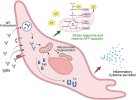
https://doi.org/10.1016/j.bbih.2026.101187
V.R.T.
Senior Member (Voting Rights)
DMissa
Senior Member (Voting Rights)
I am not sure what to make of it. It isn’t clear to me why the endpoint phenotype being checked is mitochondrial. Upstream signalling responses to the igg fragments seem like they would be more interesting to investigate in the first instance. Or an omics approach to narrow things down for subsequent assays.Curious if this could fit together with the possible responses seen in the dara pilot, the Mensa Cd38 finding and @DMissa's recent B cell finding.
Edit: To be clear I'm not a Prusty devotee in the slightest but I'm just wondering if there's anything at all of value here.
As for my recent paper there is nothing to really run away with in terms of interpreting other people’s research there. What we saw in the cell lines has to be validated in primary cells and then made sense of before I’d worry about discussing it in relation to other people’s work, unless they do lipidomics or related measurements on primary b cell populations that may do the job before I do
Edit: having looked at the mitochondrial figures the effect sizes are tiny and there are almost no significantly different results. I don't think this would be worth them pursuing further. The very common Seahorse arch-heresy has been committed: "example" oxygen consumption traces instead of figures showing all of the data are included as the results figures... "Each patient IgG was exposed to independent cells in three separate wells on each assay plate. Additionally, the same assay was performed at least three times on three separate days, and one representative result is shown here." You can't only show a hand picked example of your data? That shouldn't have made it through peer review.
Edit 2: some of the full data plots are tucked away in supplementary document 3 (for a small selection of the available parameters from these experiments only?). They do not appear to include a plot of spare capacity across all samples? Spare capacity being where the only respiration difference that I can see reported lies?
The data has to be shown.
Last edited:
neophyte32
Senior Member (Voting Rights)
My compass is clearly s4me.info. If you go on Twitter or Reddit, Scheibenbogen, Wirth, Davis, and Prusty are considered the best in the field of MECFS. Here, I get the impression it's a bit more objective... What to make of Prusty's work relayed by Scheibenbogen?
Casterofspells
Established Member (Voting Rights)
Absolutely agree with this. If there was significant alteration it’s totally fair to look deeper in an exploratory fashion. This isn’t the end of the debate but a starting point. Mitochondria that only really fold under stress perfectly fit what we see in ME as well. And a chronically turned on stress reaction causing metabolic issues makes a lot of sense as well. We won’t ever solve this riddle if we don’t look into new mechanisms after all.I wouldn't say so. They did find high statistical significance (p=0.0004) in the first test, and then it's very legitimate to explore subsets to find out what drives this. (But in general there appears to be plenty of p-hacking here)
jnmaciuch
Senior Member (Voting Rights)
Just now noticing some weird discrepancies in the number and source of data points being plotted in Figure 1:
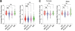
Legend says:
And 1C seems to be showing data points only from one image, despite the averages across replicate images for each participant already being plotted for 1B?
Similarly, this is 1i:
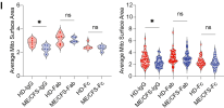
And the legend says:
Fig 1B seems to at least match the reported n's and that seems to be what the bulk of the claims are based on. But I would want the raw images shared and analyzed by someone else before even the small differences in this study could be considered credible.

Legend says:
So the right panel for 1B seems to have an issue of pseudoreplication, where each image must have been counted as one point to get that many dots. Just from a quick count of the number of dots in PCS-CFS (pink), that looks like even more dots than 15 x 3 replicates, maybe closer to 100-150. So what's being plotted? Is every mitochondrion being plotted separately despite the axis label saying "average"?B. Quantification of average mitochondrial surface area in primary HUVECs exposed to 1 μg/mL purified IgG from ME/CFS (n=39), PCS-CFS (n=15), MS (n=20) patients, and healthy controls (n=41). At least 10 cells were imaged per sample, derived from 3 replicates. In the left panel, each point represents the mean surface area across all images for each subject. In the right panel, each point represents the surface area measured from a single image. [...] C. Gender-based separation of average mitochondrial surface area from the above experiment. Each point represents the surface area measured from a single image.
And 1C seems to be showing data points only from one image, despite the averages across replicate images for each participant already being plotted for 1B?
Similarly, this is 1i:

And the legend says:
I'm guessing lower panel means right panel and things just got shifted around. Though I'm counting ~50 dots in HD-IgG on the right panel, so did they do 10 replicates each and plot them all separately? Or is this also individual mitochondria being plotted separately and just incorrectly labeled "average"?I. Quantification of average mitochondrial surface area in primary HUVECs exposed to 1 μg/mL purified IgG or Fab Fragment or Fc fragment from 5 ME/CFS, and 5 controls. In the upper panel, each point represents the mean surface area across all images for each individual. In the lower panel, each point represents the surface area measured from a single image.
Fig 1B seems to at least match the reported n's and that seems to be what the bulk of the claims are based on. But I would want the raw images shared and analyzed by someone else before even the small differences in this study could be considered credible.
I think >= 10 images of cells per person, if I'm understanding this right:Just from a quick count of the number of dots in PCS-CFS (pink), that looks like even more dots than 15 x 3 replicates, maybe closer to 100-150. So what's being plotted?
I don't have the energy right now to read this and try to figure out what exactly they mean by images/replicates etc. But I'd agree that if the right panel of 1B is based on a Mann-Whitney of many points per individual, then the significance stars above the plot are likely unreliable.At least 10 cells were imaged per sample, derived from 3 replicates.
Isn't 1C split by gender, unlike 1B?And 1C seems to be showing data points only from one image, despite the averages across replicate images for each participant already being plotted for 1B?
jnmaciuch
Senior Member (Voting Rights)
Images usually contain more than one cell—I think what they’re saying there is that they had 3 replicate images per sample, making sure that at least 10 cells were visible across all 3. Though the wording is very confusing so maybe something else weird is happening here. [Edit: Either way you slice it, more than 3 replicate averages per sample are being counted there so we need an explanation of what exactly it is that they are plotting.]I think >= 10 images of cells per person, if I'm understanding this right:
Yeah the sample numbers make sense with splitting the cohort—the issue I’m pointing out is that unlike 1B, it’s not showing averages across replicates, it’s showing averages across one image (if the legend can be trusted). It’s just a weird choice to make because they wouldn’t have had to re-image anything to do a subset analysis—why not just show the same averaged data points as 1B and avoid adding in any outlier skewing?Isn't 1C split by gender, unlike 1B?
Hmm, yeah, the caption says each point is an image, but the number of points seem to add up to the number of individuals, so maybe they labeled it wrong?Yeah the sample numbers make sense with splitting the cohort—the issue I’m pointing out is that unlike 1B, it’s not showing averages across replicates, it’s showing averages across one image (if the legend can be trusted). It’s just a weird choice to make because they wouldn’t have had to re-image anything to do a subset analysis—why not just show the same averaged data points as 1B and avoid adding in any outlier skewing?
jnmaciuch
Senior Member (Voting Rights)
It says “each point represents the surface area measured from a single image” so the only way I can interpret that is:Hmm, yeah, the caption says each point is an image, but the number of points seem to add up to the number of individuals, so maybe they labeled it wrong?
they had a number of images for each participant, chose only one per participant for 1C, and averaged across cells from one image. I’m hoping the legend is wrong because otherwise I don’t see how that’s not cherry-picking. But the legend being incorrect to that extent doesnt inspire much confidence either.
neophyte32
Senior Member (Voting Rights)
InitialConditions
Senior Member (Voting Rights)
Do the findings of the recent Ryback et al. paper refute these results?
jnmaciuch
Senior Member (Voting Rights)
Somewhat. If antibodies induced substantial differences in mitochondrial capacity then you might expect to see that in the Ryback study too (though different cell types were used and that could theoretically make a difference).Do the findings of the recent Ryback et al. paper refute these results?
But that wasn't a main finding in this paper anyways, and the Ryback study didn't measure mitochondrial fragmentation, which was the main (albeit weak) finding of this paper

