Data visualization

ryanc97

Senior Member (Voting Rights)
This post copied, and the following posts moved from Comparable Immune Alterations and Inflammatory Signatures in ME/CFS and Long COVID, 2025, Petrov et al
----------------------------------------------------------------------------------------------


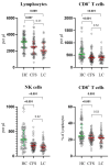
Big diff in NK cells. Don't need any p value to see that. Just eyes.

HC looks evenly distributed. CFS compressed and lower.

These guys haven't discovered histograms? Why do they insist on using this weird jitter plot?

I've seen this jitter plot elsewhere. Is it because these guys don't know Python/R and are using some software to generate them,?
1768393960853.png
 
Last edited by a moderator:
These guys haven't discovered histograms? Why do they insist on using this weird jitter plot?

I've seen this jitter plot elsewhere. Is it because these guys don't know Python/R and are using some software to generate them,?
I'm not a fan of the overlapping points here making it hard to see exactly how many there are. But otherwise these types of plots are very common in papers on biological markers. As far as I can recall, histograms are rarely used for something like comparing cell counts.
 
These guys haven't discovered histograms? Why do they insist on using this weird jitter plot?

Histograms are almost completely useless in this situation. We need to see the individual data points. I am not particularly impressed by the differences. Most values are within the normal range. Some of the spreads are truncated but artefacts can do that. Higher NK values in normals might reflect more physical activity recently or something.
 
I prefer these jitter plots because they show each datapoint, which isn't the case with a histogram.
Why would you need to show each datapoint on a one-axis graph? Showing the point doesn’t add any information that can’t be extracted from a histogram, and the histogram has the added benefit of showing the distribution of values.

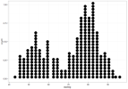
I guess they could make a stacked dot histogram (imagine this vertically).
IMG_0556.png
 
I guess they could make a stacked dot histogram (imagine this vertically).
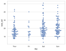
It's basically the same thing except the exact value can be shown in a swarm plot, instead of being put in bins of arbitrary width in a histogram.

swarmplot_5_0.png

But swarm plots where the points are overlapping, like in this paper, don't seem as helpful because you can't see the distribution clearly.
 
It's basically the same thing except the exact value can be shown in a swarm plot, instead of being put in bins of arbitrary width in a histogram.

View attachment 30130

But swarm plots where the points are overlapping, like in this paper, don't seem as helpful because you can't see the distribution clearly.
The bins are a good point, but how much granularity do you realistically need?

On that graph, would it be sufficient to round to the nearest point? At some point pixels and resolution of the image will create arbitrary bins, so it’s not like it’s entirely avoidable. So when is the tradeoff worth it for easier visual comparison?

You could keep the raw values for analyses and just use the bins for the visual presentation.
 
Why would you need to show each datapoint on a one-axis graph? Showing the point doesn’t add any information that can’t be extracted from a histogram
Think what you show is called a dot plot. Histograms are normally used to group different values on the x-axis. It turns continuous x-values in categories or bins so that each data point is no longer visible, just the frequency of each bin.
 
On that graph, would it be sufficient to round to the nearest point? At some point pixels and resolution of the image will create arbitrary bins, so it’s not like it’s entirely avoidable. So when is the tradeoff worth it for easier visual comparison?
I'm not sure what you mean by round to the nearest point.

Is it difficult to compare groups in the plot I shared? Along with an overlaid median line and maybe box plot, it seems to be good to see differences in distribution.

I guess a histogram looks a little less visually messy.
 
I'm not sure what you mean by round to the nearest point.
Oh I understand. Basically bin them to the width of one of the circles.

Yeah, I mean like here's a paper where after they corrected an error in their plot, they switched to the binned dot plot/histogram type visualization. I like the exact values on the left better.

Edit: But I can see an argument for it looking more organized for easy comparison.
1761435739543.png
 
Last edited:
Oh I understand. Basically bin them to the width of one of the circles.
I meant to the nearest value in increments of 1, but that almost looks like the width of a dot in this case.
Yeah, I mean like here's a paper where after they corrected an error in their plot, they switched to the binned dot plot/histogram type visualization. I like the exact values on the left better.
Those are not histograms, though. Histograms start at the left and stack towards the right, like using «align left» in a text document. The new plot in that paper uses the equivalent of «centre text».

If you use align left with binned dots, you’d get my preference.
Think what you show is called a dot plot. Histograms are normally used to group different values on the x-axis. It turns continuous x-values in categories or bins so that each data point is no longer visible, just the frequency of each bin.
I think they can be combined like I tried to explain above.
 
Oh okay, I thought you were mainly aiming for the binning aspect, not necessarily keeping it asymmetrical like a standard histogram.
I should have been clearer that it’s to aid the visual inspection of the data.

And at some point you’d have to address the question of significant digits. Is it really that important to see the difference between 32.3 and 32 on a scale between 0 and 50? I’d argue it’s not worth the cost of making it more difficult to judge the distribution of the values.
 
Histograms are almost completely useless in this situation. We need to see the individual data points. I am not particularly impressed by the differences. Most values are within the normal range. Some of the spreads are truncated but artefacts can do that. Higher NK values in normals might reflect more physical activity recently or something.
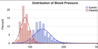
Well, now you know that you can set the bin width to 1.... for comparing overlapping distributions the histogram is the best visual tool.

1768461053738.png
 
Last edited:
Except we do not call them histograms. We call them dot plots or scatter plots and for this type of data they seem to me the obvious thing to use.
I think they might sometimes be called «unit histograms», at least according to this blog.

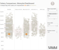
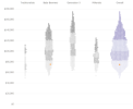
I prefer this:
IMG_0557.png
Over these two:
IMG_0558.png
IMG_0559.png
Because the first make it so much easier to compare the different plots because the differences along the X-axis aren’t halved in size visually by making everything symmetrical.

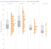
If you want you can add box plots:
IMG_0560.png
 
Back
Top Bottom