ryanc97
Senior Member (Voting Rights)
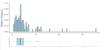
A scatterplot shows x and y relationship, a histogram shows only x relationship where the y axis is frequency.
In this case you could bin it into say bins of 20 NK cells wide e.g 20-40 and within one bin you might have say 10 people, so rather than stack 10 dots you draw a bar that is 10 high.
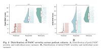
Either way histogram > this funny jitter boxplot stuff, but biologists are not the best at presenting data, since their focus is biology, not data visualisation, so it's just one of those things.
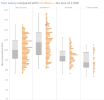
You can see from their jitter plot, 250 is the 95th percentile for ME but 250 is the median / 50th percentile for HC. It's a big difference.
In the Fluge Mella study the 3 highest NK cells who were responders were above 250.


