Rock1 protein

Does anyone know, does that happen automatically in some widely used chart-making software, or do you have to select some options to consciously produce a chart like that?
It is automatic in a couple softwares—this looks like GraphPrism, which is a very “user friendly” (meaning you don’t need to know a coding language to use it) propriety plotting software. It’s possible the user doesn’t even have access to a setting that would turn it off.

[Added: The points in that plot appear to be automatically plotted by relative density, meaning that the sections of y axis with the highest density of points get plotted out horizontally to span the maximum width of the box plot, and then other “bins” with lower densities of points are spread out relative to that maximum]
 
Last edited:
[Added: The points in that plot appear to be automatically plotted by relative density, meaning that the sections of y axis with the highest density of points get plotted out horizontally to span the maximum width of the box plot, and then other “bins” with lower densities of points are spread out relative to that maximum]
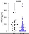
And that might be okay if the algorithm was applied according to the data frequencies across both samples rather than within each sample, or if the number of data points in each sample was similar. But in these situations where the number of datapoints in one cohort is a small fraction of the number in the other cohort, the approach that is being taken results in a misleading chart.
 
But in these situations where the number of datapoints in one cohort is a small fraction of the number in the other cohort, the approach that is being taken results in a misleading chart.
I'm not really understanding in what way it's misleading. The number of points in the left plot is clearly visible here. I think the difference in cohort sizes would be less clear if the points were squished together.
 
I'm talking about the chart in post #6.
I've copied it here.


Screenshot 2025-10-03 at 7.30.11 pm.png

Yes, The number of points in the left plot are clearly visible, but the number of points in the right plot is not. Even though there are more data points on the right hand side, the width of the right hand side sample isn't bigger. If the same approach of piling data points nearly on top of each other was applied to the left hand side as was applied to the right hand side, the left hand side would look pretty much like just a solid line. Instead, the four data points on the left at 1000 are shown as a substantial bulge in frequency.

I think if the same rules for how far apart data points are spaced were used in each cohort, it would give quite a different impression of the data.

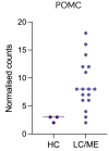
Edit - I don't think the chart design is the biggest issue going on here, and certainly the chart where there are just three control data points* is an example of one of the bigger problems. I understand the idea of weighting the data so distribution shapes can be compared, and that can be good. I just think the idea falls apart when the sample size of one cohorts is small (as do most other aspects of data comparisons).

*
1759477266468.png
 
Last edited:
If there is any bad publicity for Amatica in this thread, it’s entirely their own doing. Don’t worry about that.

That’s unfortunately quite common.

It’s very understandable that you’re looking for answers, but going off the responses from others I’m not sure there’s much to be learned from the tests. Even if there was, the forum rules prohibits giving (or requesting) any diagnoses or treatment recommendations.
Thank you for your reply. So, concretely, the absence of Rock1 in plasma is not reported in current scientific articles in humans, but only in mice. Rock1 knockouts (according to AI) would cause mitochondrial, immune, and autophagy problems, but since it hasn't been studied in humans, we can't draw any conclusions. As for treatments, I don't come here for that, but simply to educate myself on this atrocious disease that has taken everything from me (my company, almost my marriage, my dignity, my presence with my children...). Thank you again.
 
I think the purpose of the chart is to be able to visually compare the relative distribution of the values along the y axis. The x axis does not act as a kind of histogram for comparison of absolute values between the groups.
 
Tweet quote:

We've just found that ROCK2 is reduced in our patients who reported PEM (figure attached), ROCK1 was trending lower as well (figure in original thread)

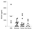
We haven't yet looked at severity. We are collecting very detailed questionnaire data on PEM which will be very interesting and we are collecting longitudinal samples before and after PEMThis is very preliminary but in the first sample we have analysed we saw a drop in ROCK1 after PEM was triggered.

We have quite a lot more of this data and will be releasing a preliminary series in the next few days

 
Last edited by a moderator:
If the same approach of piling data points nearly on top of each other was applied to the left hand side as was applied to the right hand side, the left hand side would look pretty much like just a solid line. Instead, the four data points on the left at 1000 are shown as a substantial bulge in frequency.
I can't see this being more useful.

We currently can see that the "substantial bulge" is four or so points next to each other now. If they were all squished together on the left side, there'd be a more or less a thin line on the left side, with a bulge still in the same location but where it's hard to figure out how many points there are.

Even though there are more data points on the right hand side, the width of the right hand side sample isn't bigger.
I don't think a large difference in number of participants between groups is inherently problematic. Lots of studies have huge differences in group sizes, for example DecodeME. I think the absolute size of each group is more important, since a small sample is less likely to be representative of the population. And here we can clearly see the size of the smaller group.

the chart where there are just three control data points* is an example of one of the bigger problems
I don't think the chart is the problem. The sample size of 3 is the problem. But given a sample size of 3, the chart itself looks fine to me. I don't feel misled that there are more than 3 points.
 
I don't think the chart is the problem. The sample size of 3 is the problem. But given a sample size of 3, the chart itself looks fine to me. I don't feel misled that there are more than 3 points.
Yes, that was exactly my point in my comment there, there are other more important problems. The problem illustrated in that chart is that there are only three controls. My point in that comment is that there are more important problems/questions with Amatica's suggestion of issues with Rock proteins - e.g.
  • uncertainty about whether people in the ME/CFS group actually have ME/CFS,
  • use of a reference paper that did not actually provide data on levels of the Rock proteins
  • uncertainty about the collection, storage and delivery process that might have influenced the quality of the samples, and therefore explain the substantial numbers of zero results in the ME/CFS group, versus the controls probably just being a convenience sample of people (Amatica employees, people doing the analysis) so their samples could be treated carefully and processed rapidly
  • the small number of controls
  • a lack of any matching of controls on demographic features that might be important (e.g. age, sex, medications)

(I continue to think that these hybrid sort of violin dot point charts where the jitter/spacing of points on the x axis differs in the two cohorts that are being compared can unfairly influence people's perception of what the distribution of points on the y axis means about populations. If points in one cohort are spread out more than in the other, it can emphasise certain parts of the distribution, and that can be particularly problematic if the sample size is small.

I was prompted to make the comment because we saw just the other day in a paper (not an Amatica one) where the use of both a bigger (square) data point marker and a wider x axis jitter spread in one cohort had doubly influenced perception of the distribution. I think it's a valid observation, one to watch out for when we look at charts like this, but it's a small point and it has rather overtaken this thread. Use of different jitter widths in the two cohorts being compared doesn't make the chart wrong, but I think it can lead us to accept an interpretation of the data more easily than we should. I'm going to stop defending this now, so we can focus on more important points.)
 
Last edited:
I'd really like to see info on precisely how they are running these tests. Their website doesn't seem to have any details about the methods. They are testing things like BH4 and if Ron Davis is right you can't get an accurate measurement without immediately processing the blood. If I recall, Davis said they had to engineer a special collection devise to stabilize BH4 in order to measure it accurately because no commercial solution existed. I see similar things with measuring AngII, etc. Without knowing what methods they are using, there is no way to tell if any of these results are real.
 
I'd really like to see info on precisely how they are running these tests. Their website doesn't seem to have any details about the methods. They are testing things like BH4 and if Ron Davis is right you can't get an accurate measurement without immediately processing the blood. If I recall, Davis said they had to engineer a special collection devise to stabilize BH4 in order to measure it accurately because no commercial solution existed. I see similar things with measuring AngII, etc. Without knowing what methods they are using, there is no way to tell if any of these results are real.
I can testify: Blood test in the morning, my lab centrifuges and then freezes the blood immediately. DHL Express arrives around 12 p.m., the blood tubes are in a cooler (Amatica takes care of that), and it arrives the next morning in Manchester.
 
Back
Top Bottom